看到一个好看的网页,很多人第一反应是:能不能让AI照着做一个?
比如看到一个电商首页:浅色背景、黑色细边框、四列商品网格、胶囊按钮,促销区居中排版。现在要做一个 CNC 设备展示官网,业务完全不同,但希望页面有类似的视觉气质。
如果只对模型说:
参考这个网页风格,帮我生成一个 CNC 设备官网。
直接上来就让它写 HTML,结果通常不会太理想。AI可能记住了浅黄色背景、黑色文字、橙色按钮,却漏掉更重要的结构:卡片为什么没有间距,边框怎么分隔,标题和价格怎么排,首屏左右分栏是什么比例。
方法:先提取设计规格,再生成 HTML
更好用的做法是先让有多模态能力的AI模型看截图,把关键的设计规格提取出来,再让AI按这份规格生成页面。
这样产生的“复刻”可以迁移它的视觉语言:配色、排版、卡片、按钮、分隔线、商品列表,以及那些一眼能看出来、但很难一句话讲清楚的细节。
这个方法分两步,简单说,就是先看图写规则,再按规则写页面。
第一步,用多模态模型读取网页截图,提取设计元素。截至目前,性价比最高的模型是 Gemini 3 Flash。它看图效果好,速度快,成本也低。
第二步,把这些元素整理成的设计规格 JSON,交给AI模型进行HTML代码生成。
这份规则可以叫“设计规格 JSON”,也可以叫“设计指南”。它有点像给模型看的 design tokens,但范围更大。传统 design tokens 通常是颜色、字号、间距、圆角;这里还会写布局、网格、边框、组件关系、文字排列、图片和标签的位置。
第一步:从截图里提取设计元素
第一步的 Prompt 会让模型扮演像素级 UI/UX 检查员和设计系统逆向工程师。它不评价页面好不好看,只提取截图里的视觉规则,最后输出 JSON。
比如没有阴影,就写没有阴影。没有圆角,就写直角。后面生成 HTML 时,模型拿到的是明确规则,而不是“简洁”“高级”“现代”这类很难执行的形容词。
可以直接使用这段 Prompt:
# Role: Pixel-Perfect UI/UX Inspector & Design System Reverse Engineer

## 🎯 Objective
Your task is to analyze the provided UI screenshot and extract a **High-Precision Design Specification** in JSON format.
**Do not summarize.** You must inspect specific visual attributes based on the detailed checklist below.
If an attribute is missing (e.g., no shadow), explicitly state "None".

## 🔍 Inspection Checklist (The "Rulebook")

You must evaluate the image against these specific dimensions:

### 1. Global "Physics" (Base Rules)
* **Colors:** Identify specific usage. Don't just list colors; define which is `Background`, `Surface`, `Primary Brand`, `Border`, and `Text-Muted`.
* **Corner Strategy:** Look at buttons and cards. Are they `Sharp (0px)`, `Slight (4px)`, `Modern (8-12px)`, or `Full (Pill)`?
* **Shadows:** Are elements flat? Or do they have `Diffuse Shadows`, `Hard Borders`, or `Glows`?

### 2. Layout Topology (Structure)
* **Container:** `Fluid (100%)` vs `Fixed (e.g., 1200px)`.
* **List Pattern:**
    * `Uniform Grid`: All items identical size (e.g., 4 columns).
    * `Masonry`: Items aligned vertically but varying heights.
    * `Bento/Hierarchy`: First item large, others small.

### 3. Component Deep-Dive (CRITICAL for Accuracy)
* **Spatial Relationships (Overlays):**
    * Check Date Badges/Tags: Are they *inside* the image? *Overlaying* the edge? *Floating*?
    * Check Metadata: Is it aligned with the title or the badge?
* **Internal Micro-Layouts (Flex Logic):**
    * **Vertical Stack vs. Inline:** For a date badge, is "15" above "Oct", or are they side-by-side "Oct 15"?
    * **Alignment:** Is text Center-aligned or Left-aligned?
* **Decoration:** Look for *underlines*, *colored bars*, *icons*, or *background patterns*.

---

## 📝 FORCED OUTPUT JSON SCHEMA

Please fill out the following JSON. The values provided in the schema are **examples/options** to guide your analysis. Replace them with actual observed data.

```json
{
  "1_global_design_tokens": {
    "palette_logic": {
      "page_background": "#HEX (e.g., #F9F9F9)",
      "card_surface": "#HEX (e.g., #FFFFFF)",
      "primary_brand": "#HEX (Used for: Buttons/Links)",
      "text_main": "#HEX",
      "text_muted": "#HEX (Used for: Dates/Meta)",
      "border_color": "#HEX (e.g., #E5E5E5 or None)"
    },
    "shape_rules": {
      "global_corner_radius": "e.g., 8px",
      "button_shape": "e.g., Pill-shape (Full Rounded)",
      "input_field_style": "e.g., Gray background, no border"
    },
    "typography_vibe": {
      "headings": "e.g., Bold, Tight spacing (-0.02em)",
      "body": "e.g., Relaxed line-height (1.6)"
    }
  },

  "2_layout_structure": {
    "section_container": "e.g., Centered Fixed Max-width ~1200px",
    "grid_system": {
      "type": "Uniform Grid / Masonry / Asymmetrical",
      "columns_desktop": "e.g., 4 Columns",
      "gap_size": "e.g., 24px (Approx)"
    },
    "section_header_style": {
      "alignment": "Center / Left",
      "decorative_elements": "e.g., 'Small orange bar (40px) under title' OR 'None'"
    }
  },

  "3_component_anatomy_analysis": {
    "primary_card_component": {
      "container_style": {
        "border": "e.g., 1px Solid #EEE / None",
        "shadow": "e.g., Large diffuse shadow on Hover",
        "padding": "e.g., 0px (Image flush) or 20px (Internal padding)"
      },
      "media_image": {
        "aspect_ratio": "e.g., 16:9 / 4:3 / 1:1",
        "position": "Top / Left"
      },
      "complex_elements_topology": {
        "date_badge": {
          "is_present": true,
          "position_type": "e.g., Absolute Overlay / In-Flow / Straddling Edge",
          "exact_location": "e.g., Bottom-Left of Image area",
          "internal_layout": "e.g., 'Vertical Stack (Day on top of Month)' OR 'Inline Single Line'",
          "visual_style": "e.g., Orange Background, White Text"
        },
        "meta_info_row": {
          "is_present": true,
          "content": "e.g., Eye Icon + Count",
          "position_relative_to_badge": "e.g., 'To the right of the badge' OR 'Below the title'",
          "vertical_alignment": "e.g., Center-aligned with badge"
        }
      },
      "text_content_flow": {
        "title": {
          "weight": "Bold",
          "margin_top": "e.g., 16px from image"
        },
        "excerpt": {
          "lines": "e.g., Clamped to 2 lines",
          "color": "Muted Gray"
        }
      }
    }
  }
}
这段 Prompt 把“网页风格”拆成一组关键设计指标。
关键设计指标包括:
-
颜色用途:背景、卡片表面、品牌主色、边框、弱化文字。
-
形状规则:卡片、图片、按钮、输入框是直角、小圆角、大圆角还是胶囊形。
-
阴影与边界:靠阴影做层次,还是靠边框、分隔线或发光效果。
-
页面结构:容器是全宽还是固定宽,板块之间怎么分隔。
-
列表模式:统一网格、瀑布流,还是 Bento 布局。
-
组件关系:标签、日期、价格、标题、图片之间怎么摆放。
-
内部微布局:日期上下堆叠还是横向排列,文字居中还是靠左。
-
装饰元素:下划线、色条、图标、背景块、横线、竖线是否参与风格表达。
这些指标作为网页设计的关键指标。后面生成 HTML 时,页面像不像参考页,主要看这些信息有没有提取到位。
举个例子。只写 #F49F1C 没什么用。写成“这个颜色用于主按钮和促销标签”,模型才知道怎么放。
布局也一样。浅黄色背景、黑色 1px 分隔线、四列商品网格、卡片零间距,这些都要写进规格里。
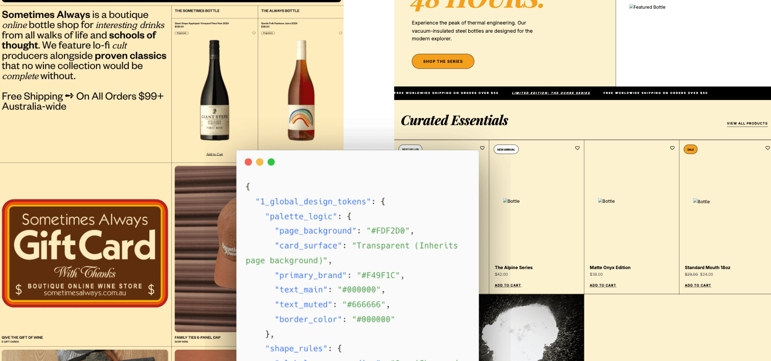
设计规格大概是什么样
一份提取出来的的设计规格大概是这样:
{
  "1_global_design_tokens": {
    "palette_logic": {
      "page_background": "#FDF2D0",
      "card_surface": "Transparent (Inherits page background)",
      "primary_brand": "#F49F1C",
      "text_main": "#000000",
      "text_muted": "#666666",
      "border_color": "#000000"
    },
    "shape_rules": {
      "global_corner_radius": "0px (Sharp edges for containers/images)",
      "button_shape": "Pill-shape (Full Rounded for Email/CTA buttons)",
      "input_field_style": "Pill-shape, white background, thin black border"
    },
    "typography_vibe": {
      "headings": "High-contrast Serif (e.g., Cheltenham or similar), Bold, Tight tracking in hero text",
      "body": "Clean geometric Sans-serif, Uppercase labels for secondary metadata",
      "links": "Underlined sans-serif for 'Add to Cart'"
    }
  },

  "2_layout_structure": {
    "section_container": "Fluid 100% width with internal gutters; heavy use of 1px black horizontal and vertical dividers",
    "grid_system": {
      "type": "Uniform Grid for products; Asymmetrical 2-column for feature blocks",
      "columns_desktop": "4 Columns (Product grid)",
      "gap_size": "0px (Items separated by 1px borders)"
    },
    "section_header_style": {
      "alignment": "Left-aligned for main copy; Center-aligned for 'Hold the phone!' promo",
      "decorative_elements": "Thin black hairline dividers (1px) separating major site sections"
    }
  },

  "3_component_anatomy_analysis": {
    "primary_card_component": {
      "container_style": {
        "border": "1px Solid #000000 (Grid layout)",
        "shadow": "None",
        "padding": "20px internal gutter"
      },
      "media_image": {
        "aspect_ratio": "3:4 (Portrait focused bottles)",
        "position": "Center-aligned within the grid cell"
      },
      "complex_elements_topology": {
        "date_badge": {
          "is_present": false,
          "notes": "Uses Product Tags instead"
        },
        "product_tag": {
          "is_present": true,
          "position_type": "In-Flow / Absolute Top-Left of cell",
          "exact_location": "Top-Left corner of the product grid cell",
          "internal_layout": "Single line pill",
          "visual_style": "Pill shape, White background, 1px Black border, Small sans-serif text"
        },
        "meta_info_row": {
          "is_present": true,
          "content": "Heart (Wishlist) icon",
          "position_relative_to_badge": "Opposite side (Top-Right corner)",
          "vertical_alignment": "Top-aligned with product tag"
        }
      },
      "text_content_flow": {
        "title": {
          "weight": "Bold / Semi-bold Sans-serif",
          "margin_top": "12px below image area"
        },
        "price": {
          "weight": "Regular Sans-serif",
          "color": "#000000",
          "position": "Immediately below title"
        },
        "cta": {
          "style": "Text link, Underlined",
          "alignment": "Bottom-left of cell"
        }
      }
    },
    "promo_banner_component": {
      "style": "Image-led with text overlay or adjacent blocks",
      "cta_style": "Large Orange Pill Button for 'Sign Me Up!' or Text + Arrow for 'Learn More'"
    }
  }
}
比如 card_surface 写的是继承页面背景,表示商品卡片不应该另起白底。gap_size 写的是 0px,并说明卡片之间靠 1px 边框分隔,模型就不容易写成常见的圆角白卡片。

第二步:让模型生成 HTML
有了设计规格,就可以生成页面。最短可以这样写:
设计一个卖 cnc 设备的展示官网。
使用 single html 和 tailwindcss。
遵循下面的指南:
后面接第一步生成的设计规格 JSON。
如果需要更加详细的约束,可以补充更加具体的描述内容:
请根据下面的设计规格,生成一个单文件 HTML 页面。

页面主题:一家销售 CNC 设备的展示型官网。
技术要求:
- 使用 single HTML
- 使用 Tailwind CSS
- 不依赖构建工具
- 页面需要能直接在浏览器打开

页面结构:
- 首屏
- 产品能力
- 应用场景
- 技术参数
- 客户案例
- 联系转化区

设计要求:
- 严格遵循设计规格 JSON 中的颜色、字体、圆角、边框、网格、按钮和分隔线规则
- 内容可以替换,但视觉规则要保持一致
- 图片可以用占位块,并写清楚 alt
- 移动端不能出现文字溢出

设计规格 JSON:
{...}
参考站可能是卖酒的,生成页面可以是卖 CNC 设备的。参考站可能是生活方式电商,生成页面可以是保温杯产品页。 业务内容变了,但颜色策略、网格结构、按钮形状、边框系统和排版节奏,通过设计规格JSON文件,来进行复刻。
示例效果
下面是一个复刻出来的页面示例。浅色背景、黑色细边框、首屏左右分栏、商品四列网格、促销区居中排版、胶囊按钮,都保留下来了。